Amid wacky armchairs that resemble giant sea sponges, a black leather sofa in the shape of a canoe, break-out areas with Playstations and a “Sky Room” with stunning city views, groovy is the byword in this next generation office development, packed with bright colours and playful design and enough glazing to keep window cleaners abseiling from now until the end of time.
It’s the kind of environment that will kill off any notion of wanting to work long term from home. Why sit amid kitchen clutter when you could be in a building with perfectly organised work spaces, breakout areas, coffee docks, meeting rooms, privacy pods, expansive views, more couches that you could shake a Stylus at, better décor than your own home and no interruptions to the creative thought process such as a demented urge to hang out clothes.
For anyone like me who has worked in bog-standard office environs for many years, Penrose Dock is a joyous game-changer, one that blurs the line between workplace and leisure space (there’s even a gym in Penrose One), although it does run the risk of actually becoming your Second Home, because you prefer it to your own.
I’m pretty sure I could live on Floor 8 of Penrose Two (the development includes two blocks, Penrose One and Penrose Two, as well as early 19th century Penrose House) which has just been fitted out by Wilson Architecture in anticipation of the imminent arrival of new tenants, Israeli tech firm Varonis.
Lead architect Frank O’Mahony says the brief from their client was to make it as “uncorporate” as possible.“I’ve been an architect for a long time and it’s the first time someone asked me to avoid making it look like a corporate office to a high degree,” he says. In achieving this goal, which they did admirably, they tic-tacked with Yael Hershkowitz, Varonis’ global facilities operations manager, based in New York.
“We did it over Zoom, she oversaw the project, samples were sent back and forth. Most of the furniture was sourced abroad, in Italy, Germany, Spain. Some of it was quite expensive,” Mr O’Mahony says.
For sure, there’s no bargain-bin pieces to be seen, everything sits nicely with the expensive €125m development that is Penrose Dock.
Because Varonis is the kind of company where employees tend to work in different groupings, Mr O’Mahony says they decided to divide Floor 8 into zones. Their client also wanted a local flavour to their trendy offices so each zone was named after a county Cork town – Macroom, Fermoy, Cobh, Kinsale – with a separate ‘downtown’ zone representing a communal “town square” area where everyone can get together to have a coffee or chat, or to brainstorm, or to admire those breathtaking, south-facing views.
Each of the zones is stylistically different. In one break-out area, what looks like pieces of a shipping container, sprayed in lavender, frame a service counter. Nearby, Playstations are in evidence.
Another zone has a nautical theme and nearby, cross-sections of tree trunks form a feature wall. The overall effect, as Mr O’Mahony says, is more New York loft apartment than corporate office.
As well as the Varonis floor (all of the floors are column-free, ensuring uninterrupted views) Wilson Architecture looked after the public spaces in the buildings. In Penrose Two, plans for offices on the ground floor were jettisoned in favour of a large townhall floor space, available to all tenants for event-hosting. The fit-out is funky enough to double as a night-club.
A stunning nine-storey glazed atrium stretches above the double height reception space, allowing natural light flood down through the building’s core, with glass balconies running around the atrium at each floor level. Mr O’Mahony describes it as “art deco style”.Truly, it’s the kind of space DJ Stevie G would have a field-day in, all snazzy lighting and tessellating wall tiles.
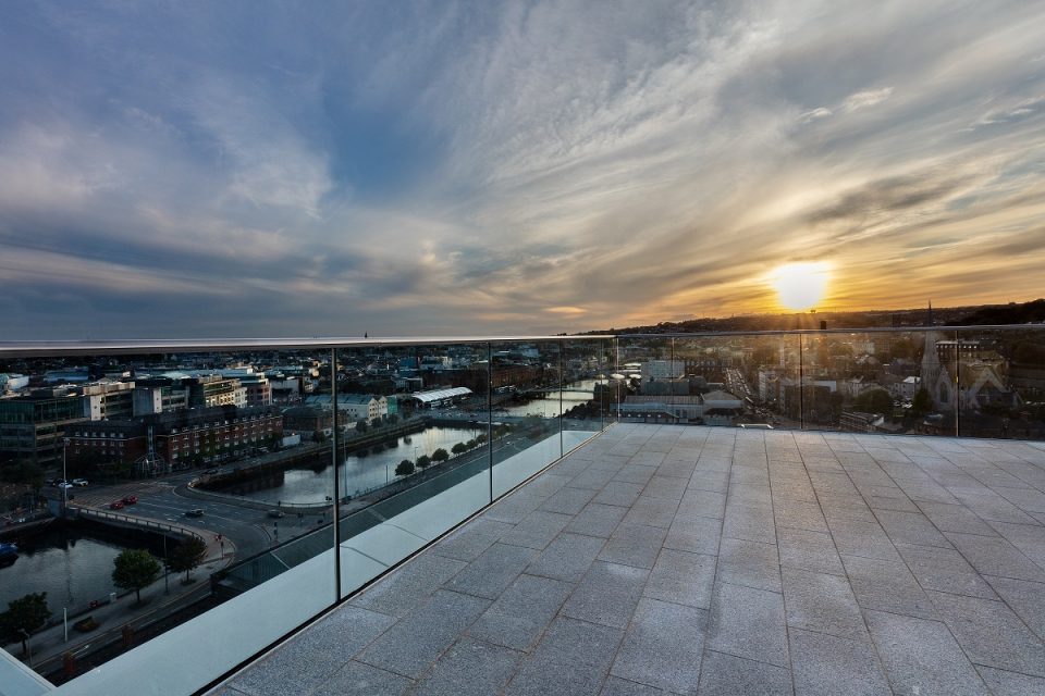
There’s another space at the very top of Penrose Two that will engender much envy among office workers whose only escape to the open air is a rooftop in Blackpool. It’s the ‘Sky Room’, Mr O’Mahony’s baby, where a plate of mirrored metal in the ceiling picks up the reflection of the city and the nearby River Lee.
“It’s designed to bring the river into the room,” Mr O’Mahony says. The back wall is black — deliberately so, says Mr O’Mahony, so as not to distract from the views — and can be opened back to reveal a concealed service area for food and beverages.
The riverfront side is glazed and beyond the glazing is a roof terrace — with couches and planting —taking in the entire sweep of the city. Any of the tenants in the building can use this space.
If ever there was a case for serious office envy, this is it. There’s just one outstanding question: “What qualifications do I need to work in this building?”

